
Google Ads are a powerful tool for driving traffic and generating leads. However, amidst a sea of advertisements, simply having a good product or service isn’t enough. Your ad needs to stand out, grab attention, and ultimately, persuade users to click. This isn’t just about clever copywriting; it’s fundamentally about understanding the psychology of how people perceive information. This article delves into the critical role of contrast and hierarchy in Google Ad design, exploring how these principles can dramatically improve your click-through rate (CTR) and overall advertising effectiveness. We’ll examine the cognitive processes involved and provide practical strategies you can implement immediately.
The online advertising landscape is incredibly competitive. Users are bombarded with ads every time they browse the internet. Their attention spans are shorter than ever, and they’re adept at filtering out irrelevant or unattractive ads. A Google Ad that blends into the background is essentially invisible. To succeed, you need to design your ads with the user’s psychology in mind. This means understanding how they process visual information, how they make decisions, and what motivates them to click. Contrast and hierarchy are two key elements that contribute to effective visual communication, and they’re absolutely crucial for Google Ad design. Let’s break down why these concepts are so important and how you can leverage them to your advantage.
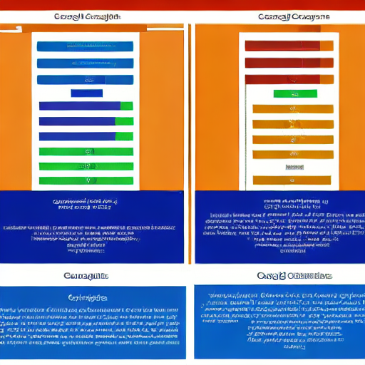
Contrast, in the context of design, refers to the difference between elements within a visual composition. It’s about creating a noticeable distinction that draws the eye. This isn’t just about using different colors; it’s about employing a range of techniques to create a visual hierarchy and guide the user’s attention. There are several types of contrast that you can utilize:
Consider a classic example: a bright red button against a white background. The boldness of the color and its placement immediately signal an action – a call to click. This is a powerful demonstration of how contrast can drive behavior.
Hierarchy, in design, refers to the arrangement of elements in a way that establishes a clear order of importance. It’s about telling the user what to see first, second, and so on. A well-defined hierarchy guides the user’s eye through the ad, highlighting the most critical information and encouraging them to take the desired action. It’s built upon the principles of contrast, but it goes a step further by organizing the information in a logical and intuitive way.
Think of a typical Google Ad. The headline is the most important element – it’s the first thing users see. The description provides supporting information, and the call to action (e.g., “Shop Now”) is the final element designed to drive a click. This sequential arrangement reflects a clear hierarchy, guiding the user through the ad and towards the desired outcome.
Now, let’s translate these principles into practical Google Ad design. Here’s a breakdown of how to apply contrast and hierarchy to maximize your CTR:
For example, consider an ad for a running shoe company. A strong headline might be “Run Faster, Feel Better.” The description could highlight the shoe’s key features and benefits. The call to action button could be “Shop Now” in a bright, eye-catching color. The image would showcase the shoe in action, perhaps a runner in motion.
It’s crucial to remember that there’s no one-size-fits-all approach to Google Ad design. What works for one business may not work for another. Therefore, testing and optimization are essential. A/B testing allows you to compare different versions of your ad to see which performs best. You can test different headlines, descriptions, calls to action, and images. Google Ads provides built-in A/B testing capabilities, making it easier than ever to optimize your campaigns.
Continuously monitor your campaign performance and make adjustments based on your findings. Pay attention to your CTR, conversion rate, and cost per conversion. By constantly testing and optimizing, you can improve your ad’s effectiveness and maximize your return on investment.
Contrast and hierarchy are fundamental principles of design that can significantly impact the effectiveness of your Google Ads. By understanding and applying these principles, you can create ads that grab attention, communicate your message clearly, and drive clicks. Remember to test and optimize your campaigns continuously to achieve the best possible results.
Do you want me to elaborate on a specific aspect of this topic, such as A/B testing strategies or specific examples of Google Ad designs?
Tags: Google Ads, Ad Design, Psychology, Contrast, Hierarchy, Click-Through Rate, Visual Appeal, Advertising, Online Advertising, Ad Copy, Landing Page


[…] SEO Optimization: Optimize your content for search engines to increase its visibility. […]