Preloader
Drag

Designing Clickable Buttons for Social Media Campaigns

Designing Clickable Buttons for Social Media Campaigns

Designing Clickable Buttons for Social Media Campaigns

Social media has fundamentally changed how brands connect with their audiences. Gone are the days of simply broadcasting messages. Today, audiences crave interaction, participation, and a sense of ownership. A crucial element in driving this engagement is the strategic use of clickable buttons. These aren’t just decorative elements; they’re gateways to deeper interactions, driving traffic, generating leads, and ultimately, achieving campaign goals. This comprehensive guide delves into the art and science of designing effective clickable buttons for social media campaigns, providing you with the knowledge and techniques to maximize your results.

Introduction

The success of any social media campaign hinges on its ability to capture attention and motivate action. While compelling content is essential, it’s often the subtle cues – like strategically placed, well-designed buttons – that convert viewers into participants. A poorly designed button can be completely ignored, while a thoughtfully crafted one can dramatically increase click-through rates (CTR) and drive significant results. This article will explore the key principles of designing effective buttons, covering everything from color psychology and typography to user experience (UX) considerations and best practices across various social media platforms. We’ll examine real-world examples and provide actionable insights you can implement immediately.

Understanding the Purpose of Buttons

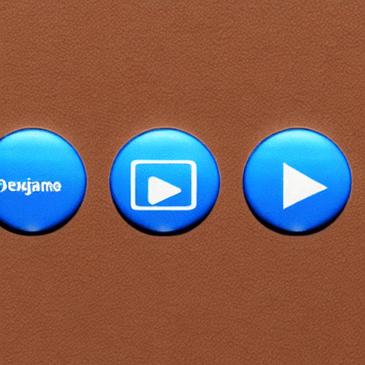
Before diving into the design specifics, it’s vital to understand what buttons are actually achieving within a social media campaign. Buttons aren’t simply about aesthetics; they serve a critical function: they direct users to a specific action. This action could be anything from visiting your website, downloading an ebook, signing up for a newsletter, participating in a contest, or making a purchase. Therefore, each button should have a clear and concise call to action (CTA) that aligns directly with your campaign objectives. Consider these common CTA examples: “Learn More,” “Shop Now,” “Sign Up Today,” “Download Now,” “Enter to Win,” “Watch Video,” “Join the Conversation.”

Design Principles for Social Media Buttons

Several design principles should guide your button creation process. Let’s break them down:

  • Clarity: The most important principle. The button’s text must immediately communicate the action the user will take. Avoid ambiguous language.
  • Contrast: Ensure the button stands out against its background. High contrast is crucial for visibility.
  • Size: Buttons should be large enough to be easily tapped on mobile devices. A minimum size of 44×44 pixels is generally recommended for iOS and 32×32 pixels for Android.
  • Shape: Rounded corners are generally preferred over sharp corners, as they feel more approachable and user-friendly.
  • Typography: Use a clear, legible font. Avoid overly decorative fonts.
  • Animation (Subtle): Subtle animations, such as a slight hover effect or a brief pulse, can draw attention to the button and encourage interaction. However, avoid overly distracting animations.

Color Psychology and Button Design

Color plays a significant role in influencing user behavior. Different colors evoke different emotions and associations. Here’s a breakdown of common colors and their potential impact on button design:

  • Red: Often associated with urgency, excitement, and danger. Best used for calls to action that require immediate attention (e.g., “Shop Now,” “Limited Time Offer”).
  • Green: Typically linked to trust, security, and growth. Suitable for buttons promoting positive outcomes (e.g., “Sign Up,” “Download”).
  • Blue: Represents trust, stability, and professionalism. A versatile color that works well for a wide range of campaigns.
  • Orange: Energetic, friendly, and playful. Effective for attracting attention and encouraging interaction.
  • Yellow: Optimistic, cheerful, and attention-grabbing. Use sparingly, as it can be overwhelming.

Typography and Button Text

The font choice and text styling for your buttons are just as important as the color. Here’s what to consider:

  • Font Size: Ensure the text is large enough to be easily read, especially on smaller screens.
  • Font Weight: Use a bold font weight to make the text stand out.
  • Line Height: Adjust the line height to ensure the text is well-spaced and readable.
  • Text Case: Sentence case or title case is generally preferred over all uppercase text, as it’s more readable.

User Experience (UX) Considerations

UX is paramount when designing social media buttons. Here’s how to prioritize user needs:

  • Mobile-First Design: The vast majority of social media users access platforms via mobile devices. Design your buttons with mobile users in mind.
  • Accessibility: Ensure your buttons are accessible to users with disabilities. Provide sufficient color contrast and use descriptive alt text for images.
  • Placement: Strategically place your buttons where they’re easily visible and accessible. Consider placing them above the fold and within the user’s natural scanning patterns.
  • Testing: Conduct A/B testing to determine which button designs perform best.

Real-Life Examples

Let’s examine some examples of effective button design across different social media platforms:

  • Facebook: Facebook buttons often use a rounded rectangle shape with a clear call to action in a prominent color (e.g., blue or green). They frequently utilize animations to draw attention.
  • Instagram: Instagram buttons tend to be more subtle, often integrated seamlessly into the feed. They frequently use a white background with a colored border to create a visually appealing effect.
  • Twitter: Twitter buttons are typically small and unobtrusive, designed to blend in with the overall aesthetic of the platform.

Best Practices for Different Platforms

Each social media platform has its own unique design guidelines and best practices. Here’s a brief overview:

  • Facebook: Leverage Facebook’s built-in button styles and animations.
  • Instagram: Maintain a consistent aesthetic with your brand.
  • Twitter: Keep your buttons small and unobtrusive.
  • LinkedIn: Use professional-looking buttons that align with the platform’s corporate tone.

Measuring Button Performance

It’s crucial to track the performance of your buttons to optimize your campaigns. Here are some key metrics to monitor:

  • Click-Through Rate (CTR): The percentage of users who click on your button.
  • Conversion Rate: The percentage of users who complete a desired action (e.g., purchase, sign-up) after clicking on your button.
  • Bounce Rate: The percentage of users who leave your website or landing page after clicking on your button.

Conclusion

Designing effective social media buttons is a critical component of any successful marketing campaign. By understanding color psychology, UX principles, and platform-specific best practices, you can create buttons that drive engagement, conversions, and ultimately, achieve your business goals. Remember to continuously test and optimize your designs to ensure you’re delivering the best possible user experience.

This detailed guide provides a comprehensive overview of button design for social media. Good luck!

Do you want me to elaborate on any specific aspect of this guide, such as A/B testing, accessibility, or a particular platform?

Tags: social media, buttons, engagement, design, interactive, campaign, Facebook, Instagram, Twitter, user experience, UX, UI, conversion, click-through rate, CTR, call to action, CTA

0 Comments

Leave Your Comment

WhatsApp